Giant Inflatable Product Replicas: Which Details to Preserve or Simplify
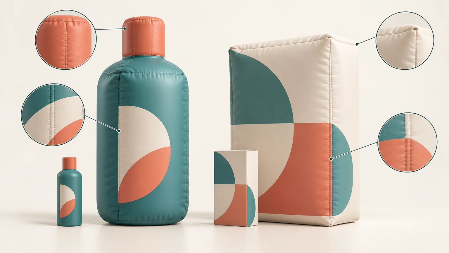
Cover: concept illustration of fictional products and inflatable detail choices; not a project photograph.
A bottle can have the right logo and still look like the wrong product. Its shoulder may be too rounded, its cap too tall, or its label may resemble a different flavour in the range. When a familiar package becomes a giant inflatable, these relationships deserve attention before the design is ready for production.
Inflatable product replica design starts with deciding what carries the identity of that particular product. Some details belong to its outline; others belong to the graphics. A proposed simplification should explain what changes and why, so the brand team can judge the result rather than approve a vague promise of accuracy.
Start with the exact product and packaging version
Choose the reference product before discussing details. A range may share a logo while using different bottle shapes, cap colours or label layouts. Identify the SKU, pack size and packaging version intended for the campaign. Otherwise, a designer can combine a current front label with an older product photograph and produce a convincing object that has never existed.
Keep the product reference and packaging artwork together. If they disagree, flag the difference instead of asking the supplier to decide which is current. A launch render might show a proposed package, while a sample on someone’s desk belongs to the previous design. State which reference governs the replica.
Distinguish the brand features shared across the range from the details that identify the selected variant. The wordmark may establish the brand, but a flavour name, colour band or model designation may establish the product. Those details can be important even when they occupy little space on the original packaging.
Our giant inflatable product replica guide covers the broader uses and placement choices. This discussion starts after you have chosen the product to reproduce.
Preserve the geometry that identifies the product
Look first at the relationship between the main parts. On a bottle, compare the body, shoulder, neck and cap. On a carton, compare the height, width, depth and shape of the top. These relationships help distinguish a particular package from a generic bottle or box carrying its artwork.
Ask which geometric features are essential to the likeness. A distinctive tapered shoulder may deserve more attention than a fine ridge around the cap. Equally, a cap can be the defining feature of a product, so there is no universal rule that small components matter less.
Where the proposed inflated form changes an edge or curve, examine the consequence against the product reference. Does the package still appear to have the intended proportions? Has a softened corner changed the apparent shape of the box? Treat those as design questions for the project; do not assume a soft construction can reproduce every rigid detail unchanged.
The giant headphones festival project illustrates the importance of the relationship between the headband, ear cups and product colour accents. The case describes a form whose identity comes from the product itself. For a packaging replica, identify the equivalent relationships before spending time on decorative detail.
Keep label elements coherent across curves and seams
A flat packaging file does not show how every graphic will look on the proposed inflated surface. Review the principal label in its intended position on the product shape. Check whether the wordmark, product name and identifying image remain related as they are on the reference package.
Pay particular attention where a graphic approaches a curve or crosses a panel join. A continuous stripe, border or illustration may need coordination between separate panels. Ask how the proposed layout handles that transition, rather than accepting a front image that hides the join.
The vehicle replica case describes mapping its livery panel by panel to align stripes across seams. That is a specific project example of treating the graphic and the shape together, rather than judging the artwork only as a flat file.
For a bottle or carton, the same discussion can focus on a label border, wraparound colour band or illustration continuing onto a side face. If the supplier proposes moving a graphic to avoid a difficult join, show the brand team the proposed change. A technically convenient position may alter the packaging identity.
Decide which details can change—and who must agree
Separate the question “is this detail visible?” from “does this detail have to remain?” Fine print may not be intended for distant reading, but that does not give the production team permission to delete it. The brand owner should identify any required wording and decide whether the display artwork may differ from the retail package.
Consider a hypothetical bottle with a ribbed cap, an embossed symbol and a detailed label. The cap ribs might be discussed as physical features or as printed shading. The embossed symbol might require depth if its appearance depends on relief. Neither choice should be treated as settled until its visual effect and feasibility have been discussed.
Use a similar approach for a carton’s fold lines, surface texture and small graphics. Ask what the proposal retains, represents differently or omits. Do not enlarge a product name, redraw a logo or remove wording merely to make the display cleaner without brand confirmation.
For custom inflatable product replicas, the useful starting point is a clear distinction between identity requirements and details open to discussion. The supplier can then address the proposed construction without having to infer what the brand considers negotiable.
Turn the choices into a product-detail decision sheet
A short decision sheet keeps the discussion specific. Give each detail its own entry, linking the original reference to the proposed treatment and the consequence the brand team needs to consider.
| Detail | Proposed treatment | Question to resolve |
|---|---|---|
| Distinctive bottle shoulder | Preserve the reference profile | Does the proposed form retain the product’s characteristic outline? |
| Wraparound label border | Coordinate the graphic across panels | How will it meet at the curve and panel join? |
| Fine cap ribbing | Compare physical detail with printed representation | Which treatment is feasible and visually acceptable? |
| Small label wording | Retain pending brand direction | Is any artwork adaptation permitted? |
These are illustrative entries, not specifications for every order. Add the relevant product reference and a confirmation status to each row. Leave an unresolved choice visible instead of letting it disappear into a general approval.
The finished unit will later need a separate comparison with the agreed design. Our guide to reviewing factory photos before shipment covers that stage.
To start your project, send the current product or packaging reference, intended display size and the details your brand requires us to preserve. Include the changes you are willing to discuss, so the first design conversation addresses the decisions that matter to your product.