A logo can keep its colours and still lose its identity when its letters become rounded volumes. The opening inside an O may look smaller, two neighbouring letters may appear joined, or a separate dot may acquire a connector that was never part of the artwork. These are specific inflatable logo design details to resolve before choosing a sculptural interpretation.
For a brand team or creative agency, the decision is which relationships the physical proposal must preserve. An opening, a narrow gap or a detached mark can carry as much identity as a coloured stroke. Compare those spaces alongside the solid shapes, rather than judging only whether the outside outline looks familiar.
Our guide to custom inflatable forms introduces brand-shaped objects. Here, the focus is narrower: the geometry of a logo whose letters or symbol become the object itself.
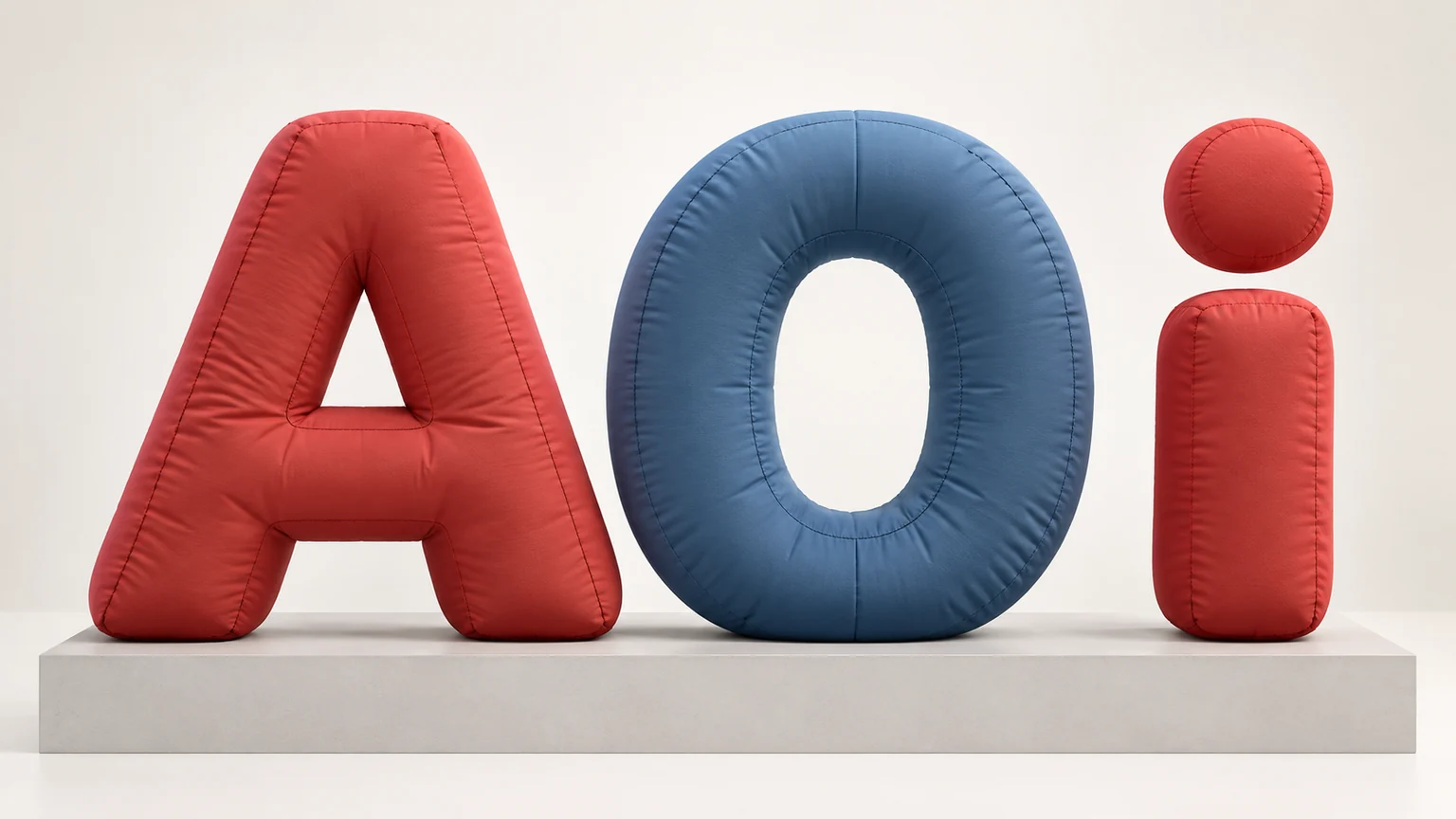
The cover is an AI-generated concept illustration using generic A, O and i study shapes. The separated dot is conceptual; it does not demonstrate a buildable support arrangement. The examples below are hypothetical, not completed client projects.
Keep letter openings distinct from printed dark areas
Start with the empty areas enclosed by the artwork. Designers call these counters: the interior of an O, the space above an A’s crossbar, or the two enclosed areas in a B. They help distinguish one letterform from another. Compare their shape and position with the surrounding strokes, not simply whether some empty area remains.
Consider a hypothetical O with a tall, narrow interior. A proposal could retain the outer height and width while giving that interior a rounder opening. Both versions may read as O, yet only one follows the particular brand’s letterform. Mark the inner contour beside the outer contour so this change cannot disappear inside an otherwise convincing presentation.
Also establish what the image actually depicts. An opening through the object, a recessed surface and a dark printed patch can look similar in one front rendering. They are different interpretations. A real opening reveals the background; a printed area carries its own colour. A recess introduces another surface inside the shape.
Ask the supplier to identify the proposed interpretation. If the request is for an opening through the letter, a dark graphic should not silently replace it. Conversely, a graphic treatment may be acceptable if the brand knowingly chooses that route. The supplier still needs to confirm which construction is feasible for the particular design; a drawing alone does not settle it.
Compare the spaces between letters as carefully as the letters
The gap between two letters belongs to the wordmark’s composition. Rounding or thickening the proposed volumes can change that gap even when the overall word remains the same width. Check the facing edges of neighbouring letters, especially where a diagonal meets an upright or two rounded sides approach each other.
In a hypothetical A–O pairing, the upper gap may be generous while the lower parts sit close together. Moving the letters apart changes both spaces at once. Slimming one stroke changes the letter itself. These are different design changes, so a request to “open it up” needs a more precise explanation.
Use the supplied artwork as the reference and mark where the proposed edges approach each other. Compare the relative pattern of wide and narrow spaces across the whole word. Uniform gaps are not automatically faithful gaps: a custom wordmark may depend on deliberately unequal spacing.
Our design approval guide covers the broader distinction between an agreed adaptation and an unnoticed change. For lettering, apply that distinction to the actual pair of edges in question. Do not stretch the whole word or edit its spacing without showing the brand what changed.
There is no universal gap or stroke thickness to prescribe here. The intended artwork, proposed size and supplier’s construction assessment must be considered together. The useful output is a comparison showing which spaces remain faithful and which require a different interpretation.
Show what happens to detached dots and symbols
A lowercase i includes a dot separated from its stem. A logo may also include an independent symbol, an accent or a small element beside the main mark. In flat artwork, those components can simply occupy their intended positions. In a physical proposal, their relationship to the rest of the display needs an explicit answer.
Do not let a floating component in a concept render imply that the support question has been solved. Ask what would locate it in the proposed display and whether any connecting or carrying element would be visible. Its appearance belongs in the design discussion; the supplier must separately establish the actual construction and installation requirements.
For a hypothetical i, compare the artwork with the complete proposed composition, including anything visible beneath or between its parts. A connector touching the dot and stem can change the letter’s outline. A shared backing can turn an empty interval into a coloured surface. Either may be a design route to discuss, but neither is visually neutral.
Keep the component’s relative position in the conversation too. Lowering a dot, enlarging it or moving a separate symbol closer to the word may make a sketch look more convenient while changing the identity. Have the brand identify which relationships it permits the supplier to reconsider. Do not infer permission from the element being small.
Choose an interpretation that preserves the important relationships
A complete sculptural wordmark is one possible brief, rather than the necessary outcome for every logo. If the proposed treatment changes too many openings, gaps or detached components, compare a different use of the same brand assets before accepting a distorted version.
One route to discuss is a dimensional symbol paired with a graphically reproduced wordmark. Another is a shaped display carrying the approved logo as surface artwork. These routes make different parts of the identity three-dimensional. Their suitability depends on the actual artwork and project; they are not interchangeable promises of an available build.
For custom product and logo forms, explain which part of the identity needs to become a physical shape. If the symbol is the landmark while the wordmark needs its original fine geometry, that distinction gives the supplier a clearer question than asking every element to become an inflated volume.
Compare the alternatives against the same priorities: the inner contours that matter, the intended spaces between letters, and the position of separate elements. Identify any font, spacing or symbol changes for brand approval. A simpler physical interpretation may be worth considering when it preserves those relationships more convincingly.
To discuss an inflatable logo concept, send the approved logo and identify the openings, gaps and detached components that define it. Ask for the proposed physical interpretation to show those features explicitly, with any visual adaptations and unresolved feasibility questions identified.