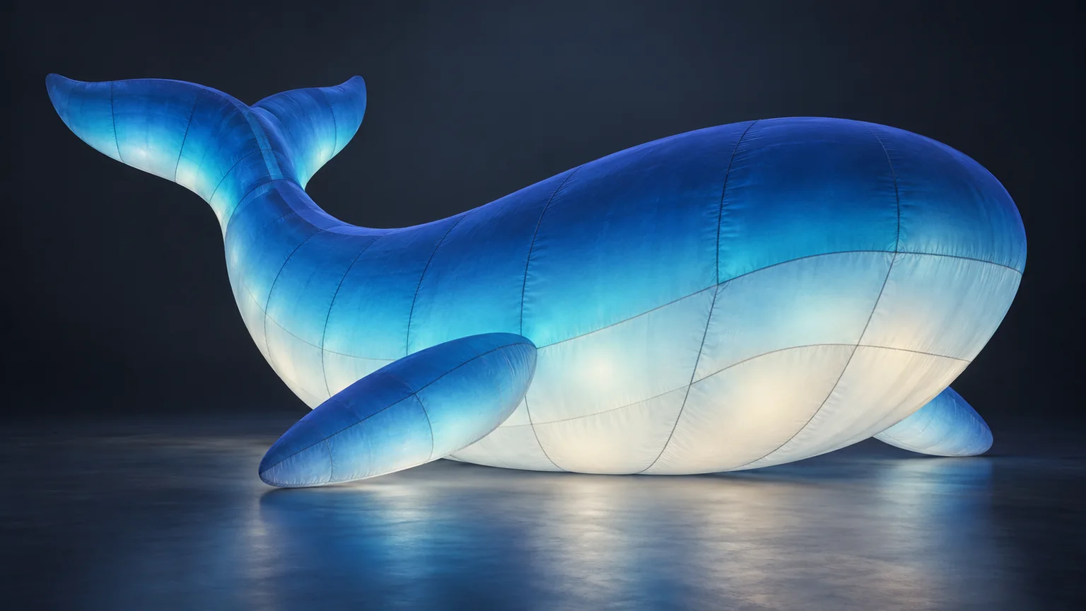
AI-generated concept illustration of an illuminated fabric form; not a project or test-inflation photograph.
A blue-to-white inflatable can look softly graduated in a rendering and show a pronounced band when illuminated. A seam can be intentionally visible yet become distracting across a face. Neither observation tells you, by itself, what needs changing. An effective LED inflatable design review starts with the intended appearance, then asks for evidence that addresses a specific visual question.
This guide concerns the glow of a custom illuminated form after the broad lighting approach has been chosen. If that decision is still open, our guide to internal versus external illumination covers that earlier choice for advertising balloons. Here, the task is to turn “the light looks wrong” into feedback a designer or supplier can investigate.
Define the intended glow before reviewing the image
Put the visual reference beside an outline of the proposed inflatable. Mark the principal viewing side and the areas that carry the design: a pale belly, a darker back, a recognizable face or a branded panel. State what each area should contribute to the whole.
Separate the intended printed colour from the requested lighting effect. A shaded region in a concept image does not explain whether the effect is meant to come from print, light or their combination. Ask the supplier to clarify the proposed approach rather than assuming that a screen gradient describes the construction.
For custom LED and light-up inflatables, identify the lighting mode being discussed. A reference for one fixed colour does not approve every colour-changing sequence. If the project needs several appearances, list those separately and leave feasibility open until the supplier confirms it.
Mark where gradients should stay continuous
Describe a gradient by its location and direction. “Deep blue across the upper body, becoming progressively lighter toward the underside” gives the review a clearer reference than “a smooth blue glow.” Mark where the transition should begin and end, and which view matters most.
Then compare the illuminated view with that intention. Does a light band interrupt a transition that should be gradual? Does a darker area belong to the approved colour pattern? Does the same area look different in another view? Record the observation without assigning a cause that the image cannot establish.
The glowing whale riverside project describes a blue-to-white printed gradient and deliberately visible seams. Its test-inflation account also discusses checking the gradient with the print illuminated. That example makes a useful distinction: the objective can be a deliberate tonal change, rather than identical brightness across the entire object.
Do not turn “even light” into an instruction to remove every dark region. First establish which differences create the intended form and which differences need clarification.
Review visible seams against the intended appearance
Visible seams are not automatically an error in a fabric installation. The question is how they read within this particular design. A faint line on an abstract shape may support its textile character, while a prominent line through a recognizable expression may deserve further discussion.
Mark the seam on the relevant view and explain its visual effect. “This line divides the eye area in the main approach view” is more actionable than “hide all seams.” Ask what appearance is achievable, and request a revised view or physical reference where needed. Do not assume a seam can simply be removed or relocated.
Keep visual appearance separate from construction acceptance. A photograph of a neat seam does not establish its strength, and a visible line does not establish a weakness. This review addresses how the lit surface looks; other specifications need their own supporting checks.
Compare illuminated views under stated conditions
Before comparing images, establish what each one shows. Request an overall view and a closer view of the questioned area on the same unit. Identify the lighting mode, the surrounding light and the viewing position. If one image is a rendering and another is a test-inflation photograph, label that distinction clearly.
Agree which audience position the overall view should represent. A close-up helps locate a seam or band, but it cannot explain how prominent that feature will be in the intended composition. Conversely, a distant image can conceal a detail that matters in a nearby photo opportunity. Use both views for their respective questions.
Camera exposure, image processing and screens can change the apparent colour and contrast. A brighter photograph is not a measurement proving that the inflatable emits more light. Where a comparison depends on subtle differences, ask whether the images were made under comparable conditions and request clearer supporting material before drawing a conclusion.
Do not diagnose an internal component fault from a bright spot alone. Mark the location, describe the difference and ask the supplier what further inspection or demonstration is needed. Our factory photo review guide explains the broader limits of reviewing finished products through images.
Turn observations into a clear revision request
Collect feedback in a short review record instead of scattering instructions across image messages. Give each item a location, the intended appearance, the current observation and a question that remains open.
For a hypothetical abstract figure, an entry might read: Front underside: intended gradual transition to pale blue; current image shows a narrow bright band. Please confirm whether this belongs to the proposed effect and provide an overall and detail view in the same lighting mode. This is an example of a communication request, not a defect threshold.
Add the reference version, the evidence requested and a status such as “awaiting clarification” or “confirmed against the agreed reference.” After a change, request the corresponding updated view. Do not close an item simply because a different image looks more attractive.
Keep unresolved physical colour references, project-specific acceptance criteria and other checks explicit. Design approval records the intended appearance; a later illuminated test provides further evidence. Neither replaces the other or establishes site acceptance.
To discuss your illuminated display, send the artwork, intended lighting appearance, scene references and marked priority areas. A clear record gives the next design discussion a concrete starting point.