Inflatable Arch Colour Psychology: Choosing Colours That Convert Foot Traffic
Inflatable Arch Colour Psychology: Choosing Colours That Convert Foot Traffic
Every brand wants their entrance arch in brand colours. Not every brand color reads well as a 4-6 metre inflatable structure competing for attention at a distance. The real decision behind inflatable arch colour choice isn’t “what’s on our style guide” — it’s whether that color still does its job of pulling people through the door once it’s blown up to arch scale and standing next to a parking lot full of other visual noise.
This isn’t about replacing your brand colors — it’s about knowing when to lean into them and when a high-visibility choice earns back more foot traffic than strict brand-color adherence costs you.
Brand Colour vs. High-Visibility Colour: The Real Tension
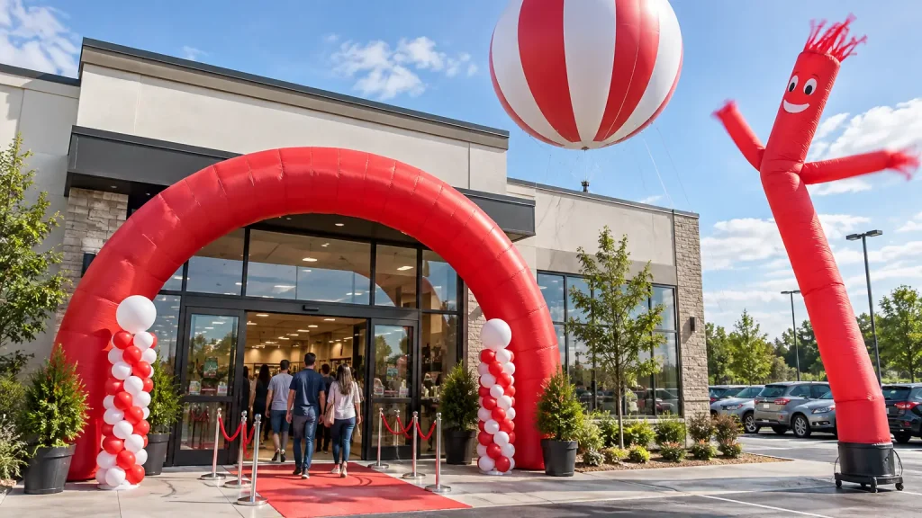
A muted navy, a soft pastel, or a low-contrast brand color can look sophisticated on a business card or a storefront sign. Blown up to arch scale and viewed from a moving car or across a crowded lot, that same subtlety often reads as “nothing much happening here” rather than “come in.” High-contrast, saturated colors — bright red, orange, yellow, strong blue against white — carry much further and register faster at a glance, which is exactly what an entrance arch needs to do in the few seconds someone has to decide whether to walk over.
The tension is real: a brand with a muted, sophisticated palette faces an actual tradeoff between staying strictly on-brand and maximizing the arch’s core job of pulling in foot traffic. There’s no universally right answer — it depends on how much brand recognition value you’re trading against how much the event depends on cold foot traffic versus people who already know to look for you.
Why High-Contrast Blocks Beat Gradients on an Inflatable Structure
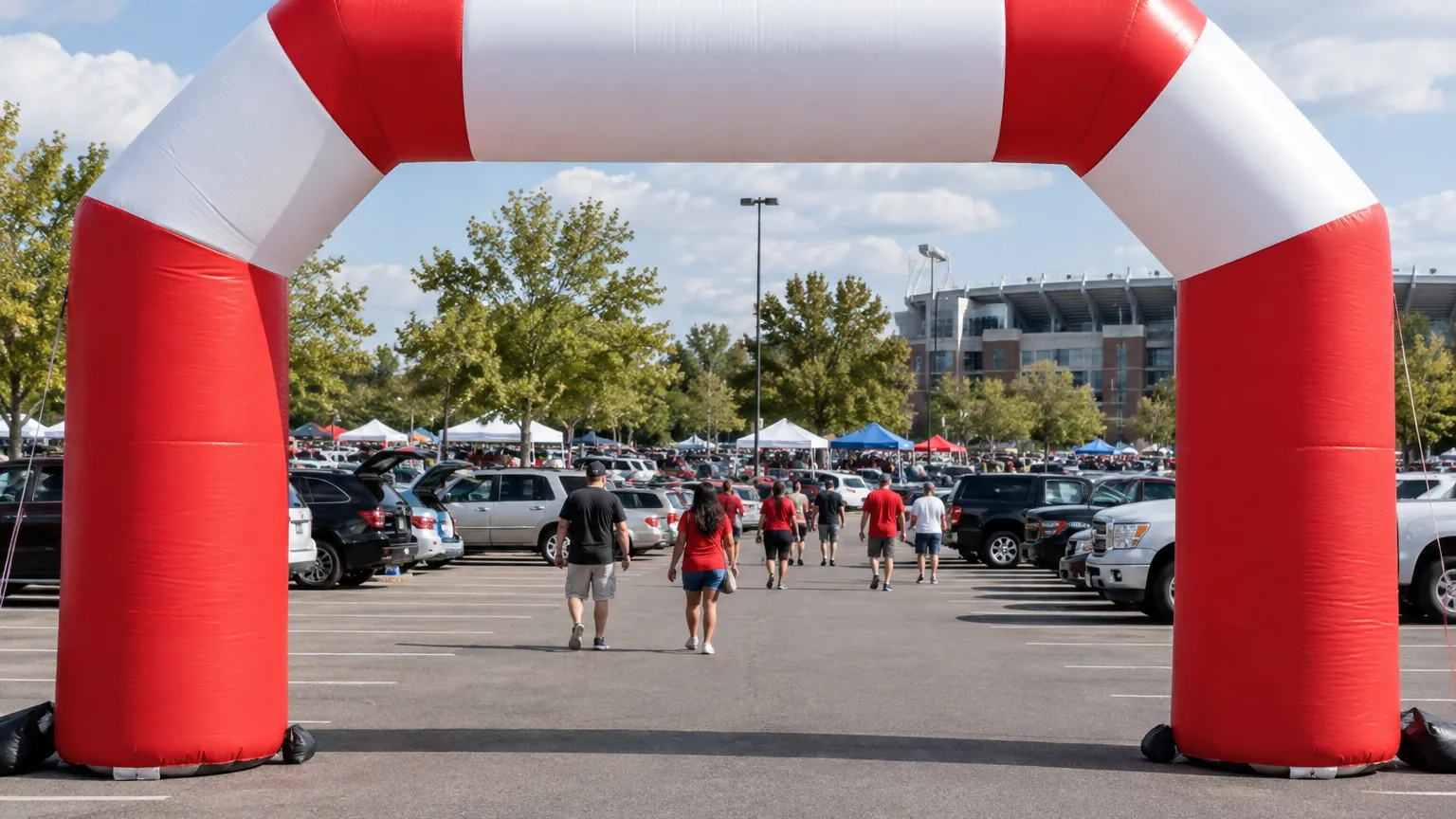
The same principle that applies to printed air dancers applies here: bold, high-contrast color blocks read at a glance, while subtle gradients, pastels, and fine detail wash out on a large curved fabric surface seen from a distance. An inflatable arch’s seams and curves also distort continuous gradients more than they distort a solid color block — a clean two-tone or three-tone design holds its shape and reads correctly across the whole span, where a gradient can look uneven or interrupted at panel joins.
Common Colour Strategies for Entrance Arches
- Primary block + high-contrast logo. One dominant brand color across the arch body with the logo rendered in a strongly contrasting color — this keeps brand identity intact while ensuring the logo itself doesn’t disappear into a similarly-toned background.
- Two-color segments. Alternating or split-color legs and crown sections create visual rhythm that catches the eye through repetition, useful when the brand palette itself is more muted and needs help standing out.
- Warning-adjacent colors at the entrance. Red, yellow, and orange carry an almost involuntary “pay attention here” association — not because they’re aggressive, but because they’re colors the eye is evolutionarily tuned to notice first. Brands without a strong existing color identity often do well borrowing from this palette specifically for the entrance structure, even if it’s not used elsewhere in their branding.
When Brand Consistency Should Win Anyway
For an established brand with strong existing recognition — a chain where the color scheme itself is the recognition trigger — deviating from brand color for the sake of raw visibility can cost more in brand dilution than it gains in foot traffic, especially at a location returning customers already know to look for. The calculation shifts for a new location, a one-off event, or a brand still building recognition, where the entrance arch’s job is pulling in people who don’t know to look for you yet — that’s where leaning toward high-visibility color over strict brand fidelity tends to pay off.
Testing Colour Cheaply Before Committing
Because full-color OEM printing is the standard production method for these arches, testing a color variant doesn’t require a completely separate tooling cost the way some print processes do — see our print methods guide for how digital and dye-sublimation printing compare for this kind of custom color work. If you’re weighing two color directions and can’t decide, ask your supplier about a smaller test panel or sample swatch before committing to a full production run.
The Bottom Line
Choose your arch colour based on the job it needs to do at your specific site — cold foot traffic from a distance, or reinforcing recognition with an audience that already knows you — rather than defaulting to brand guidelines without considering the tradeoff. High-contrast blocks generally outperform subtle brand palettes at arch scale, but the right call depends on what you’re actually optimizing for at that entrance.
Not sure which colour direction fits your site? Browse our inflatable arch range or see our branded entrance arch guide for the production side of getting your colours right.