How Trade Show Booths Use Printed Air Dancers for Aisle Visibility
A trade show floor is the worst possible reading environment for a graphic. Attendees walk past at a steady pace, glance sideways, and process visual information for maybe a second and a half before their eyes move on. Whatever’s printed on your printed air dancer either reads instantly from three aisles away, or it’s wasted print budget on a shape that just moves. This is specifically about what makes a design readable in that environment — not about picking colors you like, and not about what it costs.
Once you’ve got the visibility design right, our guides on custom colors and logo placement and booth traffic on a budget cover the ordering and cost side of the same product.
Why “Looks Good” and “Reads at Distance” Are Different Problems
A design that looks polished on a monitor or a printed proof sheet can disappear entirely on a moving fabric tube seen from 10-15 meters through a crowd of other exhibitors’ signage. Three constraints define this specific reading environment:
Distance. Most attendees notice an air dancer well before they’re close enough to read fine detail — the design has to communicate at a glance from across the hall, not up close.
Motion. The fabric twists and flexes constantly, which distorts anything with fine linework or small text far more than it distorts a bold, simple shape.
Competition. A trade show floor is visually loud — dozens of booths, banners, and lighting rigs competing for the same glance. A design has to win against that noise, not just look good in isolation.
High-Contrast Blocks Beat Fine Detail Every Time
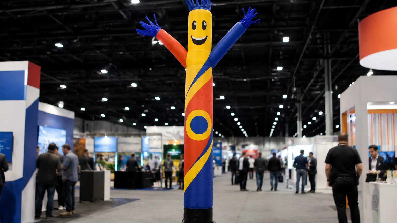
The single biggest lever for aisle-distance readability is contrast, not cleverness. A logo or wordmark rendered as a bold, high-contrast color block — dark on light or a strong brand color against white — reads instantly at distance. The same logo rendered with subtle gradients, thin outlines, or low-contrast color pairings washes out to a blur the moment it’s more than a few meters away and moving.
If your brand identity leans on fine detail (thin line art, small taglines, intricate character work), the trade-show version needs to be a simplified adaptation, not a literal shrink of your print-ready logo file. Oversized wordmarks and simplified icon versions consistently outperform detailed brand marks in this specific format.
Where on the Tube the Design Actually Gets Seen
Not every section of an air dancer reads equally well. The head and upper-body sections move through the largest arc and catch the eye first; the base moves least and is the section most likely to be partially blocked by nearby booth furniture or foot traffic. Put your primary logo or message on the upper two-thirds of the unit, and treat the base as secondary — a footer detail, not the main message.
Common Design Mistakes on the Show Floor
A few recurring failure patterns are worth designing around up front, without needing a real case study to make the point:
- Text sized for a business card, not a booth aisle. Any text meant to be read at distance needs to be dramatically larger than intuition suggests — test it by stepping back the actual viewing distance and checking legibility, not by eyeballing the file on a screen.
- Low-contrast color pairings. Two brand colors that look fine side by side in a style guide can still fail to separate visually at distance if their brightness values are too close.
- Message placed on the base section. The least-visible part of the unit is the worst place for the one thing you actually need people to read.
Print Durability for a Multi-Show Touring Schedule
Exhibitors running the same unit across multiple shows in a season put more wear on the printed surface than a single-event deployment does — repeated pack-down, transport, and setup cycles. OEM full-color print directly onto the fabric holds up to this far better than adhesive vinyl graphics, which are more prone to lifting at fold lines after repeated packing. If your show calendar runs multiple cities in a season, specify direct fabric printing rather than a lower-cost applied-graphic option, since the reprint cost of a peeling unit outweighs the upfront savings within a season or two. It’s worth flagging your touring schedule to your supplier at the artwork stage, since fabric weight and print method both factor into how the design holds up across repeated pack-and-deploy cycles.
The Bottom Line
Design for the viewing conditions you’ll actually have — distance, motion, and visual competition — not for how the file looks on a screen. Bold contrast, simplified marks, upper-body placement, and durable print methods are what separate an air dancer that gets noticed from one that’s just moving fabric in the background.
Ready to spec your trade show unit? Browse our air dancer range or see our breakdown of print methods to confirm the right process for your artwork.